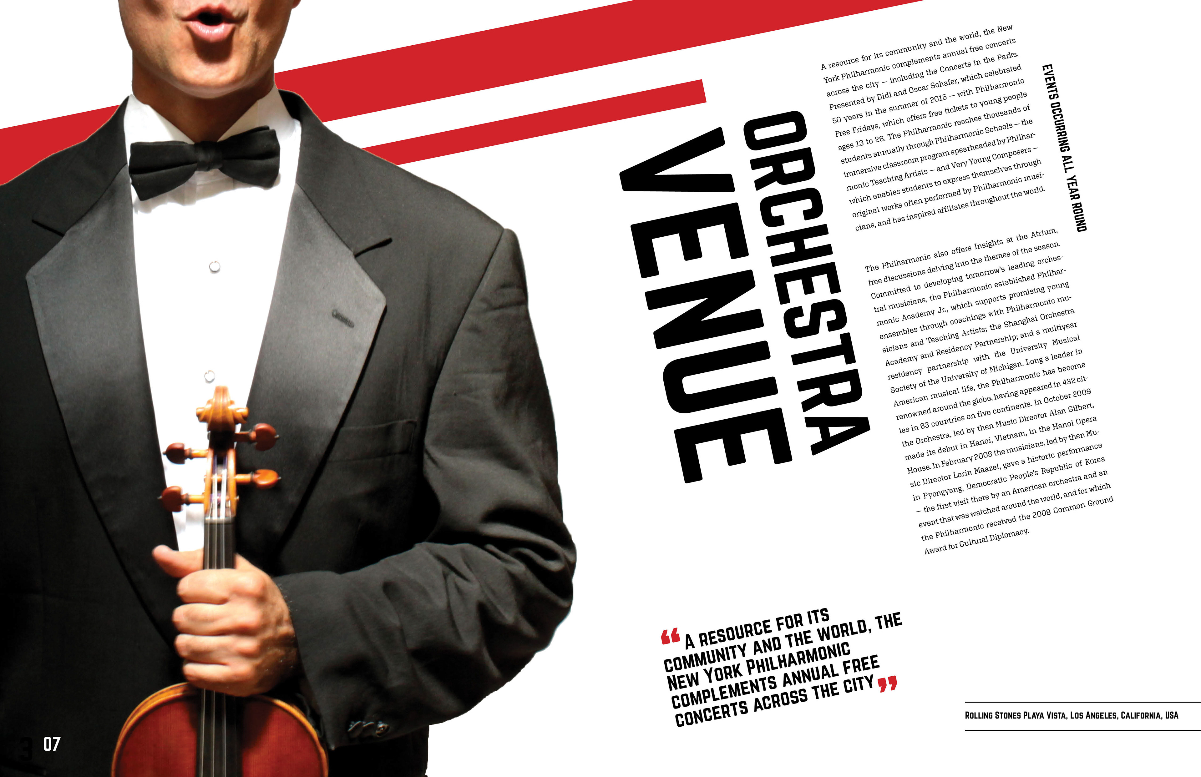
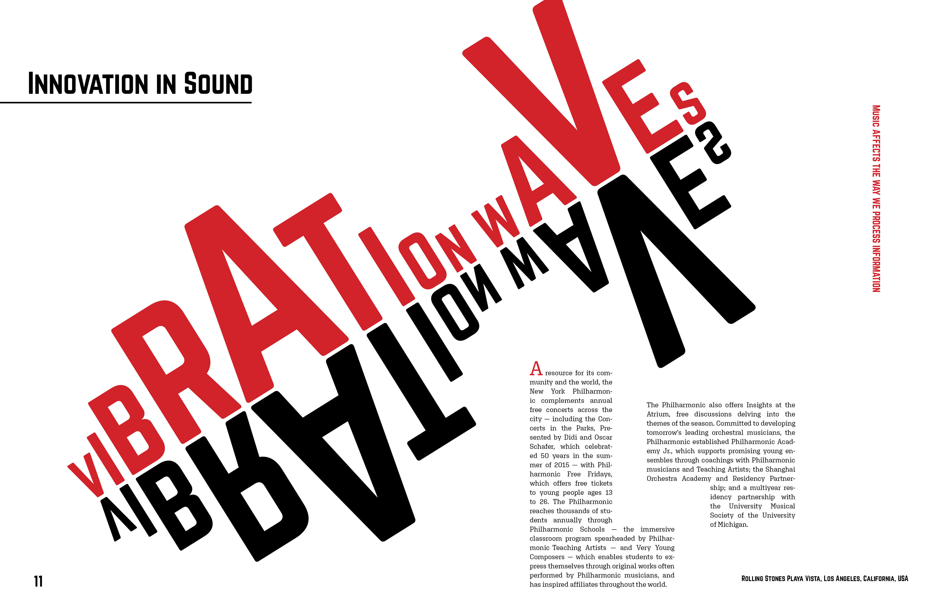
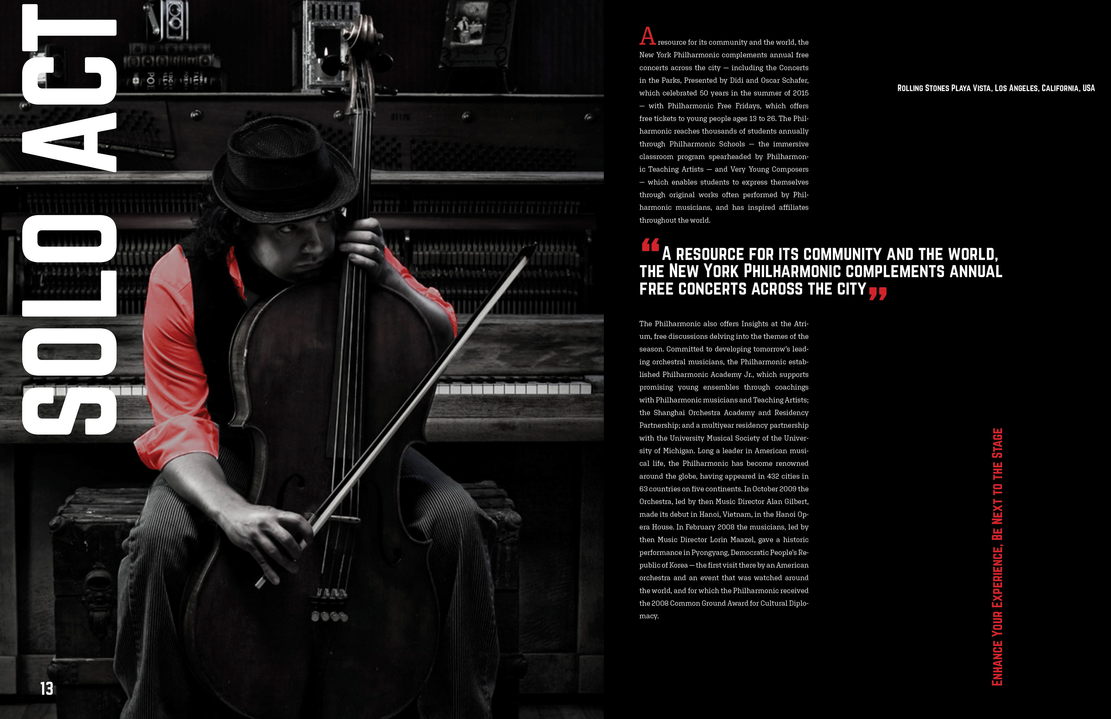
These series of spreads are from a digital magazine mock-up that I created called Symphonic Sound. In these spreads I enjoyed playing with type in relation to the image on the spread. In my design work I like to place bold san serif type next to light leaded text and long condensed paragraphs. In the second spread I tried to use the text in an unconventional way to create an illustration that presents the article's title. In the third spread I did some photoshop editing to match the color of the musician's shirt to match the color of the red text.